728x90
CSS keyframes를 이용해 애니메이션 효과 만들기
keyframes는 애니메이션 효과를 주기 위해 필요하다
키프레임을 하나의 사진이라고 생각하고
프레임이 많아질수록 플립북처럼 애니메이션이 부드럽게 진행될 것이다.
실습으로 확인하면 이해가 훨씬 쉽다
1. 기본 준비
div{
    width: 100px;
    height: 100px;
    font-size: 30px;
    background-color: red;
    word-wrap: break-word;
}

</style>
</head>
<body>
    <h1>Animation 효과</h1>
    <div>Animation</div>
</body>
</html>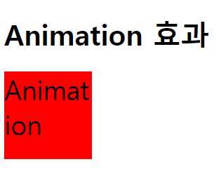
2. 키프레임 만들기
문법
@keyframes 이름 { }
mybox라는 키프레임을 생성했다
div{
    width: 100px;
    height: 100px;
    font-size: 30px;
    background-color: red;
    word-wrap: break-word;

}

/* 키프레임 */
@keyframes mybox{

}

</style>
</head>
<body>
    <h1>Animation 효과</h1>
    <div>Animation</div>
</body>
</html>
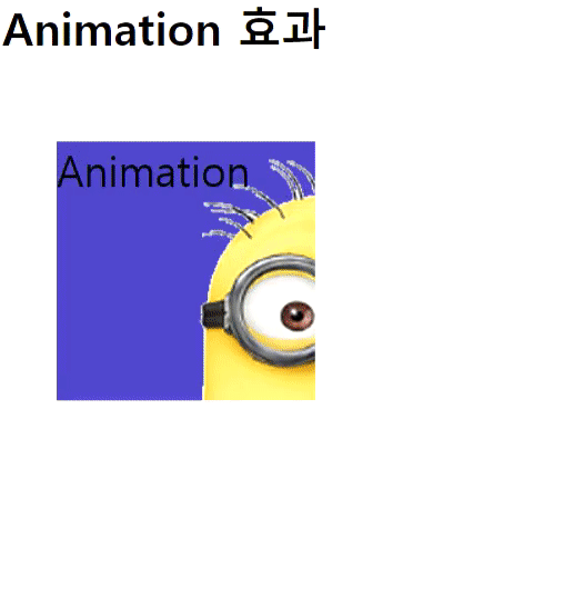
3. 속성 넣어주기
div{
    width: 100px;
    height: 100px;
    font-size: 30px;
    background-color: red;
    word-wrap: break-word;

}

/* 키프레임 */

@keyframes mybox{
    0%{ width: 150px; height: 150px; background-color: yellow; transform: translate(10px, 10px); background-image: url(image/img2.png);}
    25%{ width: 200px; height: 200px; background-color: blue; transform: translate(50px,50px); background-image: url(image/img2.png);}
    50%{ width: 250px; height: 250px; background-color: orange; transform: translate(100px,100px);}
    75%{ width:300px; height: 300px; background-color: pink; transform: translate(50px,50px);}
    100%{ width: 200px; height: 200px; background-color: red; transform: translate(10px, 10px);}
}


</style>
</head>
<body>
    <h1>Animation 효과</h1>
    <div>Animation</div>
</body>
4. 애니메이션 실행하기
animation: mybox 2s infinite;
-> mybox라는 키프레임을 2초간격으로 무한히 애니메이션 실행할 것
div{
    width: 100px;
    height: 100px;
    font-size: 30px;
    background-color: red;
    word-wrap: break-word;
    animation: mybox 2s infinite;
}
/* 키프레임 */
@keyframes mybox{
    0%{ width: 150px; height: 150px; background-color: yellow; transform: translate(10px, 10px); background-image: url(image/img2.png);}
    25%{ width: 200px; height: 200px; background-color: blue; transform: translate(50px,50px); background-image: url(image/img2.png);}
    50%{ width: 250px; height: 250px; background-color: orange; transform: translate(100px,100px);}
    75%{ width:300px; height: 300px; background-color: pink; transform: translate(50px,50px);}
    100%{ width: 200px; height: 200px; background-color: red; transform: translate(10px, 10px);}
}
</style>
</head>
<body>
    <h1>Animation 효과</h1>
    <div>Animation</div>
</body>
코드 실행 결과?
'UI > CSS' 카테고리의 다른 글
| CSS transform 정리 (0) | 2021.05.01 |
|---|---|
| CSS list-style 리스트 기호 변경하기 (0) | 2021.05.01 |
| CSS border-radius 테두리 모서리 변경하기 (0) | 2021.05.01 |
| CSS background size | image | clip / text-shadow / word-wrap | word-break (0) | 2021.05.01 |
| CSS position | z-index (0) | 2021.05.01 |